


The Psychology of Color in Graphic Design
The psychology of color in graphic design is a fascinating topic that has been studied for decades. Colors have the power to evoke emotions, convey messages, and even influence user behavior. As a graphic designer, understanding the psychology of color is crucial to creating effective designs that resonate with your target audience. But what exactly is the psychology of color, and how can you use it to your advantage?
Introduction to Color Psychology
Color psychology is the study of how colors affect human emotions and behavior. It's a complex and multifaceted field that draws on psychology, neuroscience, and design principles. According to "color is a powerful tool that can be used to influence mood, attitude, and behavior," says Dr. Joe Hallock, a renowned expert in color psychology. By understanding how colors impact human emotions, designers can create designs that elicit specific responses from their audience.
The Emotional Impact of Colors
Different colors are associated with different emotions and psychological responses. For example, red is often linked with energy, passion, and urgency, while blue is associated with trust, calmness, and professionalism. Green, on the other hand, is often connected with nature, growth, and harmony. But what about yellow? "Yellow is a color that can evoke feelings of happiness and optimism, but it can also be overwhelming and even provoke anxiety," notes color psychologist, Leatrice Eiseman. Understanding the emotional impact of colors is essential to creating designs that resonate with your target audience.
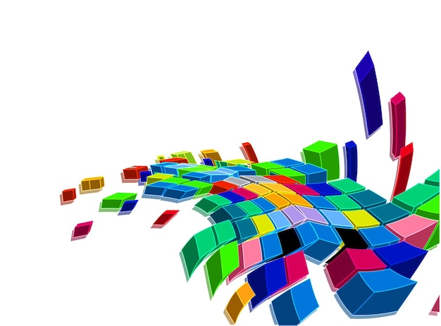
Color Harmony and Contrast
Color harmony and contrast are critical elements of graphic design. The 60-30-10 rule, which suggests that 60% of the design should be a dominant color, 30% a secondary color, and 10% an accent color, is a useful guideline for creating harmonious color schemes. Analogous and complementary color schemes can also be effective, but it's essential to consider the context and purpose of the design. For instance, a design that aims to evoke a sense of calmness and serenity may use a palette of blues and greens, while a design that seeks to stimulate energy and excitement may use a palette of reds and oranges.
When it comes to contrast, designers need to balance the use of light and dark, warm and cool, and saturated and desaturated colors. A design that lacks contrast can appear dull and uninteresting, while a design with too much contrast can be overwhelming and even provoke visual fatigue. As "contrast is what makes a design pop, but it's also what can make it fall flat," notes designer, David Airey. By striking the right balance between harmony and contrast, designers can create designs that are both visually appealing and effective.
Designing for Emotions
Designing for emotions requires a deep understanding of the target audience and their emotional responses to color. For example, a design aimed at a young audience may use bright, bold colors to evoke feelings of excitement and energy, while a design aimed at an older audience may use more muted, subdued colors to convey a sense of trust and reliability. Some key considerations when designing for emotions include:
- Understanding the brand's personality and tone
- Considering the cultural and social context of the design
- Using color to create visual hierarchy and guide the user's attention
- Balancing the use of color with other design elements, such as typography and imagery
- Testing and refining the design to ensure it elicits the desired emotional response
Case Studies
Let's take a look at some real-life examples of how color has been used effectively in graphic design to evoke emotions and influence user behavior. For instance, the Coca-Cola brand is synonymous with the color red, which is often associated with energy, passion, and excitement. The company's use of red in its branding and advertising has been highly effective in creating a sense of urgency and stimulating sales. On the other hand, the brand Calvin Klein has used a palette of blues and whites to convey a sense of calmness and sophistication, which has helped to establish the brand as a leader in the fashion industry.
Gaming Psychology Insights
The psychology of color in graphic design has far-reaching implications that extend beyond the realm of design itself. Interestingly, the same principles that guide designers in creating emotionally resonant visuals also apply to the world of gaming, where developers use color to craft immersive experiences that captivate players. As we delve into the psychology of gaming, it's fascinating to note how colors can influence player behavior and emotions, much like they do in graphic design. For instance, playing a game like Big Bang Bonus Hold & Win slot (Octoplay) can be a thrilling experience, with its vibrant colors and engaging gameplay. By understanding the psychological impact of color, game developers can create more engaging and addictive experiences, which is why the psychology of color is an essential consideration in game design, and its applications continue to inspire innovation in various fields.
Conclusion
The psychology of color in graphic design is a complex and fascinating topic that has the power to evoke emotions, convey messages, and influence user behavior. By understanding the emotional impact of colors, designers can create designs that resonate with their target audience and achieve their desired goals. Whether you're designing a logo, a website, or an advertising campaign, the psychology of color is an essential consideration that can make all the difference between success and failure. So, the next time you're working on a design project, remember the power of color and how it can be used to influence emotions and behavior. As "color is a powerful tool that can be used to create a lasting impression and drive results," notes designer, Paula Scher. By harnessing the power of color, designers can create designs that are both visually stunning and highly effective.